Photographer | Edgar Zippel, Berlin / Germany |
Project location | Berlin / Germany |
It is a tribute to Berlin: With its second outlet opened, the eyewear manufacturer demonstrates commitment to the city that already houses its production and head office. The new shop integrates neatly in the Bikini Berlin, a concept mall with boutiques, cafés and restaurants. Built between 1955 and 1957 based on designs by architects Paul Schwebes and Hans Schoszberger, the structure was upgraded and meticulously redesigned in recent years. With plans drawn up by Belgian architectural firm SAQ, the upgrade was implemented by Hild und K from Munich as executive architects.
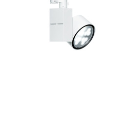
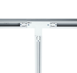
The unique shop architecture, developed by MYKITA itself for its global outlets, also defines the new shop: Retaining the original character of the location, the interior presents a bold and minimalist construction with purpose-designed, largely white furniture. The primary design element of the shop interior is the “MYKITA Wall”, a 31m long backlit structure that serves as a presentation and display area for the label’s eyewear collections. Lighting accents produced by ERCO LED spotlights direct the focus onto the product displays, the sales counter and the metal trolleys used to store the glasses. Diffused light on the support walls gives the impression of unusual depth in the room. The light colours were selected to suit different functions. The sales floor is illuminated in warm white light, complementing the white walls to create an inviting gesture in the shop. LED spotlights in neutral white form a contrast that divides off the area used for eye tests and custom-fitting eyewear. The lighting here needed to be particularly clear to ensure full focus on accuracy and precision. With the ribbed ceiling being a listed structure, mounting the luminaires presented a special challenge, which was cleverly solved by using suspended ERCO track.