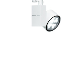
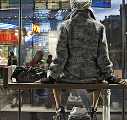
The ceiling has long been neglected as a part of architecture but is now being increasingly recognised by designers as an independent element of design. Ceilings provide a flexible basis for illuminating products and at the same time a valuable framework for brand presentation. Design flexibility in this regard ranges from expressive, technical styles to a purist or even magical ceiling appearance where luminaires remain elegantly concealed. This article explains how lighting on ceilings can be skilfully used for displaying and highlighting goods, and also outlines the possibilities of the lighting concept and specific luminaire arrangements on ceilings.
We seldom enter shops with flat white ceilings and uniform, orthogonal grids of luminaires. Such approaches would appear too similar to expressionless classrooms, corridors or rooms in administration buildings, and would definitely not have a positive effect on the shopping experience. Ceilings in shops are more frequently the exciting stage for presenting and highlighting the brand. As a counterpart to opulent, densely arranged goods displayed on tables and in shelving, shop ceilings are often the calm antithesis. A discreet, harmonious impression is created if the room's materials, colours and language of design are continued on the ceiling. According to the brand profile, an urban character is achieved by raw materials such as exposed concrete and bare ceilings, or a natural, soft atmosphere with wooden slats and textile strips. If customers are to be stimulated by the retail design, contrasts in colour and material set a counterpoint: black ceilings create a narrow, cave-like appearance whereas wide-area light ceilings hint at diffuse outdoor skies. Via the parameters of brightness and planarity, ceilings can be an important medium for atmospherically using distance or intimacy for brand communication and product presentation purposes. Ceilings can also be equipped with strips of light to help guide customers through the store.


