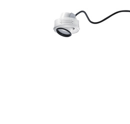
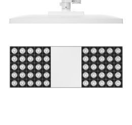
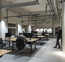
The address is both concept and inspiration. ERCO's new "Spot-on" series begins with an elegant flagship store designed by the Zurich architects Filippo Santoni and Serena Santini for the new Italian sneaker label D.A.T.E.. Located in the narrow alleys of Milan's Brera district, home to Italy's design scene, where urban life flourishes in restaurants, bars, cafés and galleries, and where the international creative world meets every year on the occasion of the furniture fair.
Other topics
Contact
Contact
myERCO
myERCO
Your free myERCO account allows you to mark items, create product lists for your projects and request quotes. You also have continuous access to all ERCO media in the download area.
LoginDownloads
Downloads
Technical environment
Technical environment
Standard for USA/Canada 120V/60Hz, 277V/60Hz
- 中文
- 日本語
Our contents are shown to you in English. Product data is displayed for a technical region using 220V-240V/50Hz-60Hz.
More user friendliness for you
ERCO wants to offer you the best possible service. This website stores cookies for this purpose. By continuing to use this website, you consent to the use of cookies. For more information, please read our privacy policy. If you click on "Do not agree", essential cookies will continue to be set. Certain contents of external pages can no longer be displayed.
{{ tu_banner_headline }}
tu_banner_copy


